The above code imports all the required libraries for this particular project.
folder_path = "/content/drive/MyDrive/Customer segmentation" # Folder path (Google Drive)
test_data = pd.read_csv("/content/drive/MyDrive/Customer segmentation/Test.csv")
train_data = pd.read_csv("/content/drive/MyDrive/Customer segmentation/Train.csv")
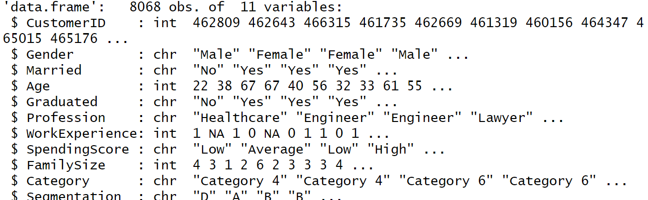
The above connect points to the location of the files in Google Drive. The "test_data" variable stores the file "Test.csv". Similarly the variable "train_data" holds the data in the file "Train.csv".
# Identify and handle missing values
numerical_features = ["Age", "Work_Experience", "Family_Size"]
missing_numerical = train_data[numerical_features].isnull().any()
if missing_numerical.any():
imputer = SimpleImputer(strategy="mean")
train_data[numerical_features] = imputer.fit_transform(train_data[numerical_features])
test_data[numerical_features] = imputer.transform(test_data[numerical_features])
STEP 2: DATA PREPROCESSING
# Identify and handle categorical features
categorical_features = ["Gender", "Graduated", "Profession"] # Adjust as needed
missing_categorical = train_data[categorical_features].isnull().any()
if missing_categorical.any():
train_data[categorical_features].fillna(value="Missing", inplace=True)
test_data[categorical_features].fillna(value="Missing", inplace=True) # Fill with same value for consistency
# Encode categorical features (one-hot encoding)
train_encoded = pd.get_dummies(train_data[categorical_features], prefix="category_", drop_first=True)
test_encoded = pd.get_dummies(test_data[categorical_features], prefix="category_", drop_first=True)
if missing_categorical.any():
train_data.loc[:, categorical_features] = train_data[categorical_features].fillna(value="Missing")
test_data.loc[:, categorical_features] = test_data[categorical_features].fillna(value="Missing")
# Combine encoded features with numerical features
train_x = pd.concat([train_data[numerical_features], train_encoded], axis=1)
test_x = pd.concat([test_data[numerical_features], test_encoded], axis=1)
The above code does the cleaning and preprocessing of data. We have done the following data preprocessing:
1. Finding and replacing blank columns in each data point and replacing it with the value "Missing".
2. One-hot encoding of categorical data is used to convert data values that contain characters to numeric data.
Then, we combine the encoded features with the numerical features in each case and store it in the variables "train_x" and "test_x" respectively.
STEP 3: K-MEANS CLUSTERING
k = 4
kmeans = KMeans(n_clusters=k, random_state=42)
kmeans.fit(train_x)
train_labels = kmeans.labels_
if test_x is not None:
test_labels = kmeans.predict(test_x)
print(pd.Series(train_labels).value_counts()) # Examine cluster sizes
This code performs k-means clustering, a technique that groups similar data points together. It takes a dataset (train_x) and splits it into a predefined number of clusters (k, here 4). Using the k-means algorithm, each data point is assigned to the closest cluster based on similarity (often measured by distance). The code then provides labels for each data point in train_x, indicating its assigned cluster. If you have new data (test_x), it can predict cluster labels for those points as well. Finally, it analyzes the distribution of data points across the clusters by printing the number of points in each cluster.
OUTPUT:
STEP -4: ANALYZING CHARACTERISTICS OF EACH CLUSTER
for feature in numerical_features:
plt.figure(figsize=(8, 6))
for cluster in range(k):
cluster_data = train_data[train_labels == cluster]
plt.hist(cluster_data[feature], label=f"Cluster {cluster}", alpha=0.5)
plt.title(f"Distribution of {feature} Across Clusters")
plt.xlabel(feature)
plt.ylabel("Frequency")
plt.legend()
plt.show()
plt.figure(figsize=(8, 6))
plt.scatter(train_data["Age"], train_data["Work_Experience"], c=train_labels)
plt.xlabel("Age")
plt.ylabel("Work Experience")
plt.title("Relationship Between Age and Work Experience (Colored by Cluster)")
plt.show()
The age distribution within the clusters reveals interesting trends. Both Cluster 0 and Cluster 1 show a peak frequency in the 30s and 40s age range. However, there seems to be a divergence in the younger and older demographics. Cluster 1 appears to have a larger population in their 20s, while Cluster 0 has a higher frequency of individuals in their 50s and 60s. It is important to note that data for only two clusters are available. Including data from the remaining clusters would provide a clearer picture of the overall age distribution across all groups.
The graph titled "Distribution of Work_Experience Across Clusters" shows the distribution of work experience in two out of four clusters, Cluster 0 and Cluster 3. The x-axis labeled "Work_Experience" shows the number of years of work experience, ranging from 0 to 14. The y-axis labeled "Frequency" indicates the number of people in each category.
The data suggests that Cluster 0 has a significantly higher number of people with little to no work experience (0-2 years) compared to Cluster 3. There are around 350 people in Cluster 0 with 0-2 years of experience, whereas Cluster 3 only has about 50 people in that category. Conversely, Cluster 3 appears to have a higher frequency of people with more work experience (4 or more years) than Cluster 0. There are around 200 people in Cluster 3 with 4-6 years of experience, whereas Cluster 0 only has about 50 people in that category.

The graph titled "Distribution of Family_Size Across Clusters" shows the distribution of family size across four clusters. The x-axis labeled "Family_Size" shows the number of family members, ranging from 1 to 9. The y-axis labeled "Frequency" indicates the number of families in each category.
The graph shows that Cluster 1 has the most families, followed by Cluster 4, Cluster 0 and Cluster 3 (in descending order). Cluster 1 has the highest frequency of families with 4 members, while Cluster 4 has the highest frequency of families with 3 members. Interestingly, Clusters 0 and 3 have a very similar distribution of family sizes, with a peak of around 2-3 family members.
The graph titled "Relationship Between Age and Work Experience (Colored by Cluster)" shows the average work experience for people in different age groups, across four clusters. The x-axis labeled "Age" shows the age of the person, ranging from 20 to 90. The y-axis labeled "Work Experience" shows the average number of years of work experience. The data for each age group is represented by a colored line, where the color corresponds to a specific cluster. However, there is no legend explaining which color corresponds to which cluster.


Comments
Post a Comment